Built to work: Introducing the new Kyan website

It's alive!
Our new website has been quietly live for a little while.
No countdown. No big launch video. No dramatic reveal.
We didn’t rush to announce it because we wanted to live with it first. To see how it felt in the real world. To break it, fix it, adjust it, argue about it, and make sure it actually did the job it was supposed to do.
So here it is, after quite some time: kyan.com, rebuilt from the ground up.
Not just to look better, but to work harder.
Why a new website?
Agency websites are strange things and working on your own internal projects is often hard and gets put to the bottom of the pile. They’re part shop window, part portfolio, part manifesto, part lead engine. They need to show our design chops and our engineering capability, but also our clarity and intent. They need to inspire confidence without trying too hard.
We’ve wanted to rebuild our site for a while, but like many agencies, we spent most of our time focused on building things for other people. I often quote the cobbler’s children situation.
Eventually we realised, the website isn’t a side project and to get it done we needed to treat it like one of our client projects. It’s one of the clearest expressions of who we are, how we think, and what kind of work we want to do more of.
So we treated it properly.
Built to work
Early on, we landed on a simple principle:
Built to work.
Not built to impress. Not built to collect awards. Not built to shout.
Built to work:
- for the people visiting it
- for the team maintaining it
- for the stories it needs to tell
- for the conversations it needs to start
Restraint is a design choice
One of the hardest parts of the redesign wasn’t adding things. It was removing them.
It’s easy for agency sites to become a franken-beast of everything: every capability, every buzzword, every animation we’ve ever wanted to try. But more isn’t always better. Often, it’s just noisier.
We stripped the palette right back and focused on hierarchy, spacing, typography, and rhythm.
The work needed room to breathe.
Each case study now flexes its own identity, subtle shifts in colour and tone that reflect the product and the story, without forcing everything into one loud system.
Typography that carries the brand
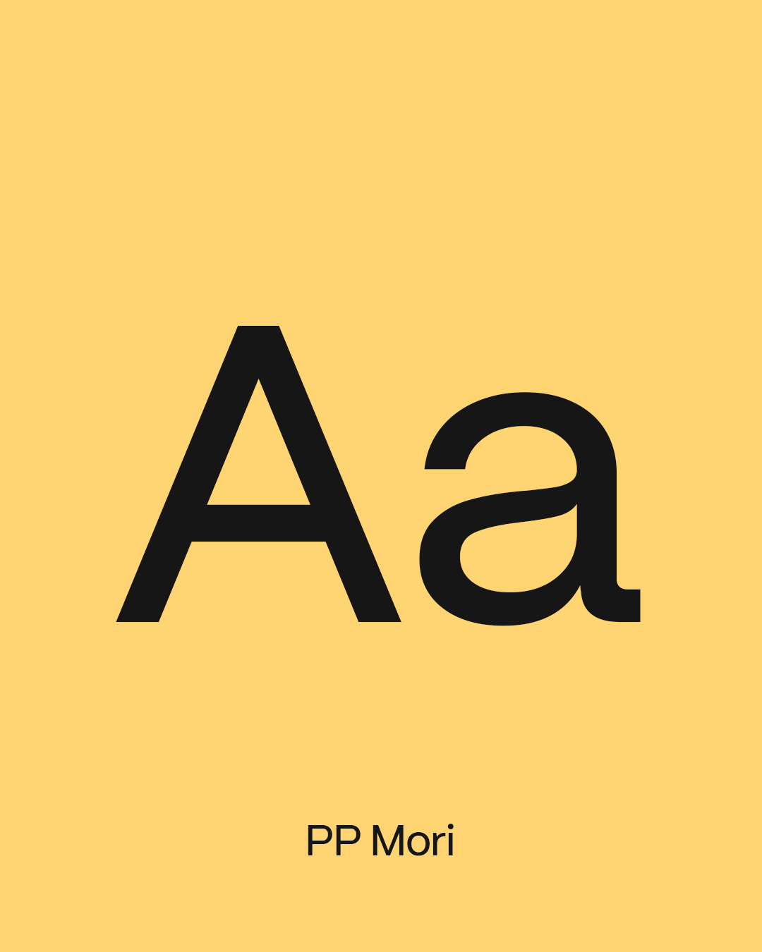
We also introduced a new brand typeface: PP Mori from the foundry Pangram Pangram.

Typography does more work than most people realise. It sets the tone before anyone reads a word. It can feel corporate, playful, cold, warm, overly designed, or effortlessly confident.
PP Mori felt right for where Kyan is now.
It’s contemporary, human, and quietly self-assured, doing a lot of heavy lifting without asking for applause.
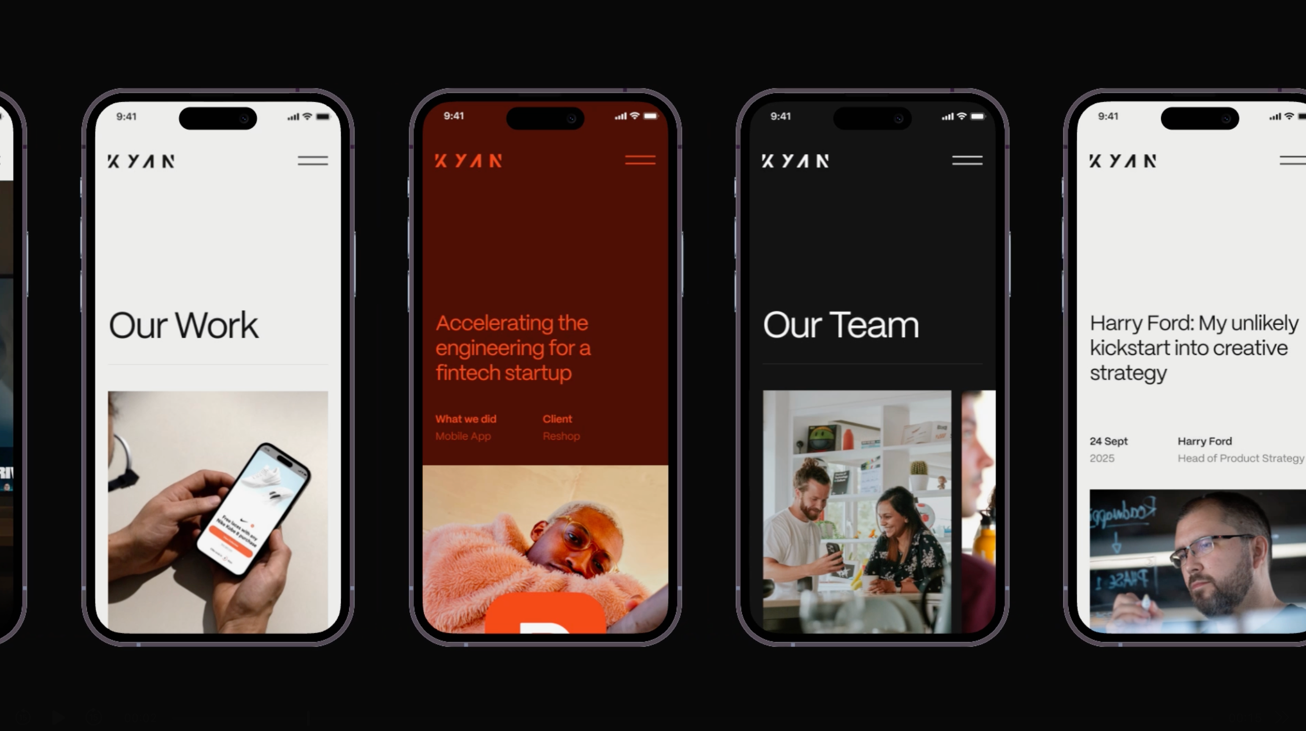
Mobile-first, properly
Most people won’t experience your website sitting at a desk with a coffee and time to spare.
They’ll see it between meetings, on a train, in an uber, late at night, in a pub, during a conversation, so we started where people actually are: on their phones.
This wasn’t a case of “make sure it works on mobile.”
This was mobile-first in the real sense , decisions made for small screens first, then scaled up.
Navigation, spacing, hierarchy, transitions… all built for thumbs before mice.
If you’ve only looked at the site on desktop, check it out on mobile.
A foundation that will last
Under the hood, the site is a fully custom build using:
- Next.js
- Storybook
- Sanity CMS
- Netlify
No framework-of-the-week decisions. Just tools that give us speed, flexibility, and a platform we can evolve over time without starting again. A good website isn’t something you redesign every two years from scratch.
It should be a living system, built on foundations that make iteration easy.
Boring choices. Excellent consequences.
Almost everyone touched it
One of the things I’m proudest of is how many people across Kyan contributed to this.
Designers, engineers, writers, strategists, almost everyone had a hand in shaping it.
Which is probably why it took longer than expected…
It’s a labour of love, yes.
But it’s also a reflection of the care we bring to our clients’ work: craft, clarity, and attention to detail, right down to the edges.
A website that works for its living
We didn’t rebuild the site to win awards.
We rebuilt it to do a job. An agency website has one real purpose:
Show how you think, prove you can deliver, make it easy to start the right conversation. Everything else is decoration.
This new site is designed to support growth, partnerships, and the kind of ambitious digital product work we want to do more of.
It’s built to work, commercially as well as creatively.
And if you’re planning something ambitious ,a new digital product, platform, or rebuild, we’d love to talk.