The Kyan Rebrand Story: Part I
Today, the term "branding" goes way further than to simply stamp ownership of something. Your brand should work to encompass far more than just your name, and how you choose to display it. Without question, the logo is an integral part of an overall brand, and it's transformation is the driving-force of a rebrand.
Over the past 18 months or so, a lot of positive changes and growth have taken place at Kyan Campus. With a complete company repositioning already taking place, the time felt perfect to evolve our visual identity and overall brand.
It's ready to go, and we're excited to say it'll be launching next week.
Here's how we approached it.
A time for discovery.
Why are we rebranding? What's needed to take us forward? These were the first questions we asked ourselves. At Kyan, almost all of our creative projects kick off with a Discover session to get things rolling and lay the foundations. Our rebrand was no exception. You can probably picture the setting: a boardroom kitted out with Sharpies, sketchbooks, whiteboard etchings, with printouts of various examples of brands we've remembered and loved over the years, blanketing the walls like something out of A Beautiful Mind. Madness.
As a team, we identified the challenges to repositioning ourselves as a more integrated, product design agency and how a rebrand was the solution. Alongside that, we evaluated an ever-present factor to Kyan as a company: Our culture. The lynchpin to our full brand experience. Our values define us, and it's something we're pretty proud of. So with that said, the next step was defining the Kyan brand story. Not just who we are, but where we want to be.
Together, we agreed on some of the core company values that the creative work would aim to embody and amplify. Settling on the foundations of the brand at this early stage ensured that once we began the visual direction, there was a goal in place and guides already set: Collaborative. Crafted. Considered.
For me personally. This was the first rebrand I'd been a part of where the 'client' was essentially ourselves. So to gain a better understanding of where we sat within the constantly evolving digital landscape, we conducted a short but valuable analysis of design agencies that we are inspired by, as well as leaders in innovation and pioneering technologies (think Oculus, Tesla etc). We quickly established that regardless of their size or what they do, their outward appearance, tone of voice and general activity were expressions of who they are as a brand. It's these things that work together to seamlessly identify them.
So how could we translate our culture into something that resonates with not just our clients, but our own team? Maintaining a light touch of playfulness that embodies our values, whilst successfully repositioning the brand. The discovery process enabled us to set out a clear picture of the overall brand architecture, and essentially a creative brief that covered off what we needed to tackle. This paved the way for all of the fun production work coming up later.
Taking a look at ourselves.
We previously defined the foundations and principles for the rebrand. Taking direction from what we learned during the discovery phase, we began to establish how we could capture the intangible values that make up Kyan. The cogs start to sync and there's a feeling of excitement in the room.
It's right to get excited about a rebrand. In many ways it's a dream project. But the number one goal of a rebrand shouldn't be to just create the most alternative looking brand you can. It's taking the time to look at yourself, clearly defining who you are, and producing an identity that works for you. Doing something different just for the sake of being different was never a consideration. Making something different is pretty easy… It's making something better that's the real challenge.
So how can we define our brand amidst the bazillion other creative agencies? To be totally honest..from the offset, we weren't all that interested in what other agencies were doing in terms of branding… spending all that time looking at what everybody else is doing, you're not taking a proper look at yourself, which is rather important when constructing your own rebrand. It's impossible to not look around, benchmark, be inspired. There are lots of agencies out there that we love, but it never needs to mutate into something overly-derivative.
Look at yourself. What does your brand say about you?
The entire creative team continues to be involved during this stage, which is a healthy mix of Design, Development, UX and Strategy. We found that it helps to have multiple points of view and opinions from the start, to boost our chances of discovering the best directions. Designers tend to think differently and often want to reinvent something based purely on the aesthetics (which is fair enough!). That's not to say they're less methodical, but having that strategic side to the discussion was really valuable, and ensured we didn't fall into the trap of over-engineering and masking what's relevant.
This stage also established an important bridge between strategy and design, which are two key areas to the Kyan creative process. It's here that we apply what we've learnt during Discovery, and brainstorm different concepts that apply to the defined idea.
Making shapes.
The wheels are in motion. Production has started, with signs of preliminary scrawlings all over the studio. Gradually, we get together a range of raw, high-level concepts, which we look over as a team and boil down to the strongest contenders. These early initial ideas are the key to progressing without doubt. They provide the reassurance required to advance with a direction — the foundation for a design that ensures we've included all the company values we set out to and are conveying our brand story.
Motivated by the visual mood boards scattered around the room, one by one, some of the designs start to evolve and bring life to our ideas. It's fair to say that during this process, we did hundreds of sketches… and admittedly, some of them we instantly knew were naff, but that's the beauty of concepting — being viable and exploring isn't just to establish what you like, but also clarify what you don't like. As you'll see later on, we didn't push on with just one concept. Instead, we saw potential in a few of the designs.
At times the jury was split, which is expected. Throughout the process, the same question kept popping up. Do we commit to giving it a full-blown facelift or effectively shift the needle slightly? So we felt it was important to move forward and take each chosen concept as far as they could stretch, in order to determine which will hold up best in a range of environments, settings etc. Eventually we came to the combined conclusion that while the plain and safe approaches looked nice enough, there was no real buzz about them. We felt that the jump we were making as a business, warranted a little more risk and bravery. What's the point otherwise?
Choosing colours and a typeface is another opportunity to effectively express yourself in a new way. Similarly to the logo, we conducted lots of trials to decide what resonated best with how we wanted to reposition our brand, whilst projecting our cultural values effortlessly. Many global brands are identifiable simply by their ownership of a specific colour, and while that wasn't something we immediately worried too much about when pulling together our own palette, we still wanted a fresh set of colours that defined us.
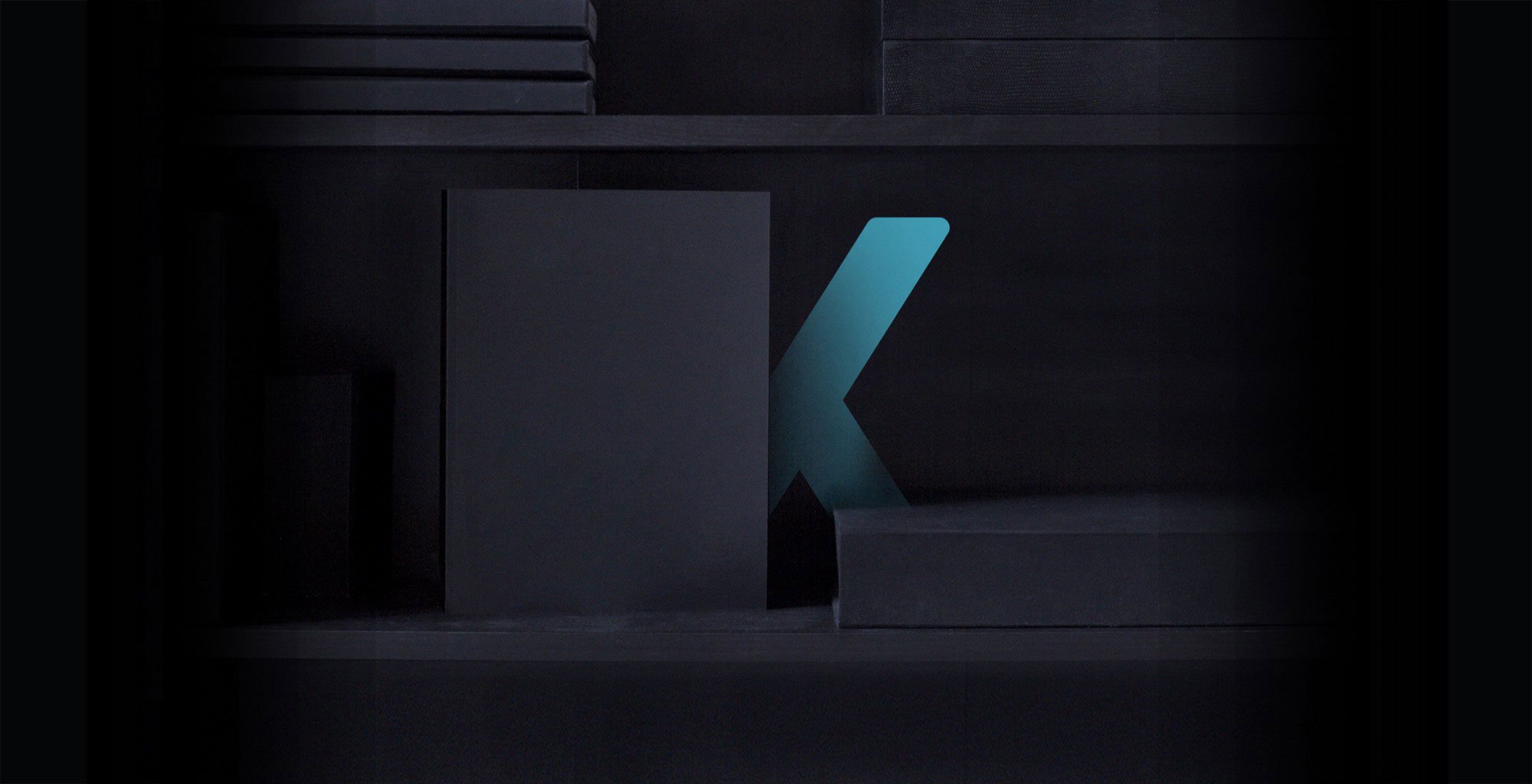
Overall, with all aspects of the brand identity, we found it was a very iterative process, and it took weeks and weeks to finally settle on one conceptual direction. There's no way of sugarcoating it: Rebranding is a beast! It's human nature to dissect and challenge a new brand direction, and with our chosen route we relentlessly tested its metal. The outcome: A visual identity to spearhead the rebrand.
When the weeks of iterations finally pay off.
Refine. Refine. Refine.
Nearly done. Not quite. With the visual identity pretty much settled on, we put the chosen logo to work. Strategy is a big part of Kyan as a company, and the new logo has inherited this characteristic in a sense. We therefore checked every angle, corner and alignment before running it across the standard collateral, business cards, motion parts, 3D models and also our new office. At Kyan Campus, you'll see flourishes of the brand colours working their way into the surroundings.
As a team, we set out to produce an all-encompassing brand experience, with a visual identity that defines us and preserves our culture. As creatives, we want to be challenged. The rebrand was an opportunity to essentially do whatever we wanted, and push things. The best work comes from when you're out of your comfort zone. Evolving the Kyan brand, the company we work for, certainly has its unique pressures and expectations. We wanted to deliver a rebrand that the entire company could be proud of. So with that said, culture wasn't just a consideration of the rebrand, but the motivation behind making sure we got it spot on too.
On reflection.
It's all about storytelling.
The likes of Pixar live by this creative philosophy. They firmly believe that their films are identifiable more because of their storytelling skills than the stunning visuals. Making the audience feel something. Whether it's nostalgia, tragedy, jubilation…this is the engine to their success. Similarly, creating and establishing a quality brand identity has, and always will be, held together by storytelling. The way that companies tell their story brings life to a brand, and it's key to engaging people and connecting with them. Storytelling is after all, the age-old method of pitching an idea, and generating a following or belief in something 🙏.
Whether it's Instagram or Twitter, the personality that a brand can create when it comes to social is arguably the pivotal factor to assess whether someone is enriched by your conversation or annoyed by it. This impacts the brand experience you're looking to maintain. A brand's voice needs to be as considered as how it looks — This sounds fairly simple but there's an art to telling your story, and our social team are meticulous in letting people know what we're up to in a way that suits us as a brand. So with the rebrand, we were keen to not stray from this, or partner it with a rigid look and feel that would struggle to compliment our tone of voice.
Bringing together this ongoing brand story maintains a positive picture, and introduces that little bit of hype here and there. Part and parcel with all the visual design and brand elements, having a strong output socially is a game-changer. It's obviously important to look the part, but interaction lets you transcend barriers and connect with your audience. Our team work hard to tailor the Kyan brand story to a varied audience, giving people a quirky insight into the #LifeOfKyan. It's this level of transparency, and day-by-day storytelling that lets us express ourselves as a team. An immersive brand people know they can talk to.
"your brand is what people say about you when you are not in the room". Amazon founder, Jeff Bezos
In a world of technology, be more human.
B2B. B2C. 'Human 2 Human' is what it comes down to. Companies configure their brand in hope of making real connections with people. Conveying a relatable, human element to your brand keeps it from being stuffy and alienated. Your company has it's very own name, a personality, even behaviours. If you were to imagine your company as a person, their name is how you refer to them, their personality impacts how you feel about them and bond with them, and their behaviours evoke intrigue.
So with that in mind, in our research we zoned in on brands of all industries and discussed the ways that they went above and beyond, maintaining this likeable human element. Even if it was simply the intro sentence on their website. Cast your mind back to a stand-out experience you've ever had with a brand, online or offline, where you came away smiling or at least with a sense of satisfaction. It might be somebody on the other end of Twitter going out of their way to sort a return for you. The material that your brand-spanking new smartphone is made of. Even the song selected for a showreel. These are all brand decisions that sit apart from the visual side of things, but are just as important.
Ultimately, a brand should compel us to feel some sort of affinity towards the company. The moniker, 'Kyan', as lovely as it is, is nothing without our team, our reputation and the passion we put into our work. The brand is everything we do and who we are. We've focussed on producing a bold, innovative logo and an overall identity, but we know that's the tip of the iceberg to a complete brand.
For us, it was a brand born out of craft, collaboration and culture. It's exciting, and after all of the hard work, it's finally ready. We're looking forward to doing a full launch and revealing the complete rebrand next week.
Written by

Pete White