Why your typeface is just as important as your logo
Your audience, whether engaging with your website, your product or even your social content, will spend more time looking at the typeface you choose than they will spend looking at your logo. Yet typography choices are often overlooked and not given the initial design consideration that they deserve.
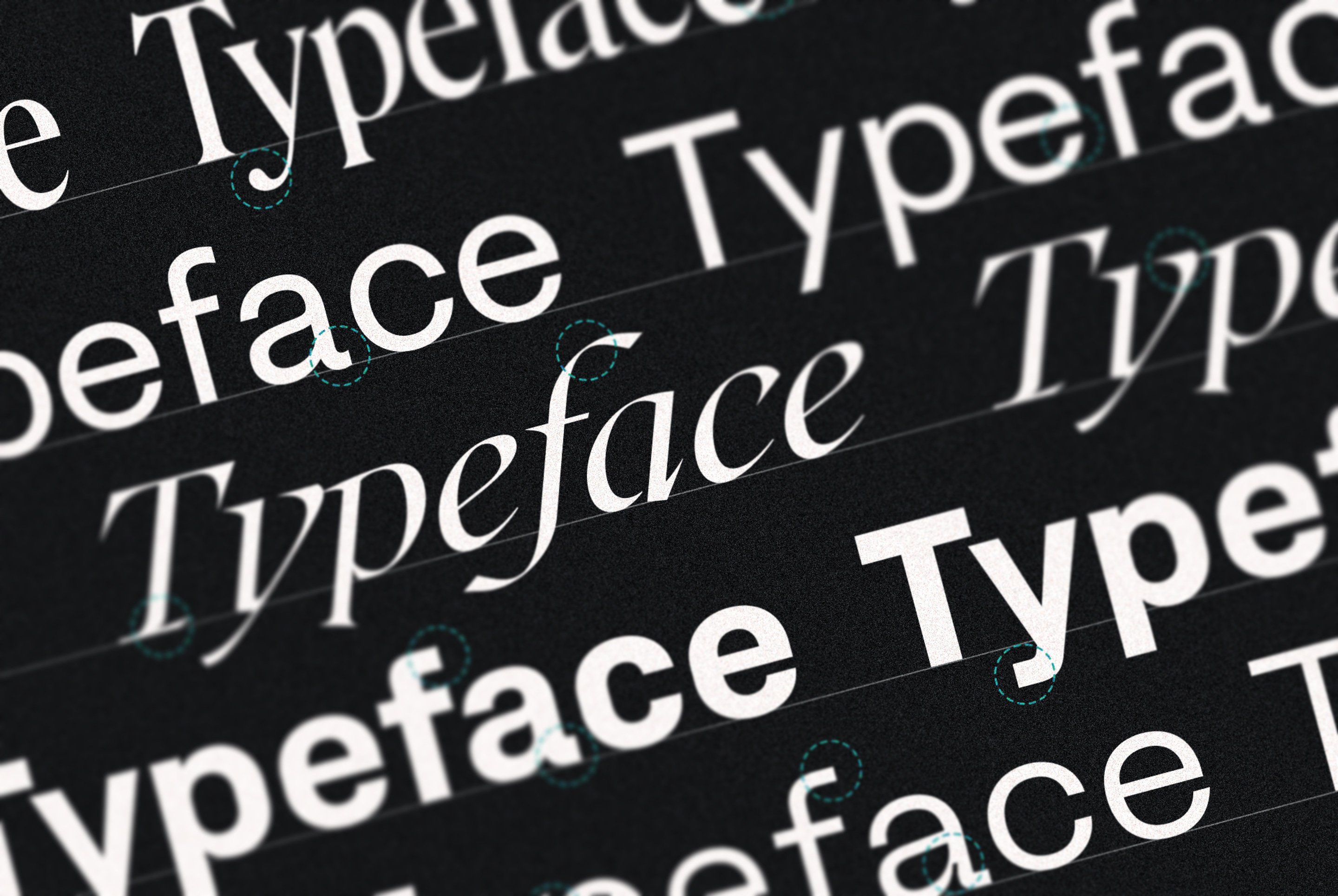
Imagine for a moment that your brand is a person. Your logo, recognisable at a glance and unique to you, would be the face. Your typographic choices would form not only the voice, but the arms and hands too. Typography has the expressive power to control how your brand sounds and articulates itself. It carries your content, your messages, your voice and therefore, your brand.
The typographic choices you make will be present at almost every customer touchpoint, from the advert that draws them in, the website that sells the product, to the welcome email they ultimately receive when they sign up. Whatever the context, if you’re communicating through written content, then your typography deserves some serious consideration during the early brand design stages of your business or service.
Finding your voice
Authenticity in a brand is more important than ever. Customers need to think and feel that they trust you, and when first impressions are vital, typography and tone of voice are essentially the gatekeepers to whether you appeal to an audience, or alienate them.
Take the following and somewhat crude example of the same sentence presented in different typefaces. Does the intended message feel different to you?
The same words can sound very different when read in a different typeface.
In most cases, you won’t be deciding between vastly contrasting type styles like this. However, the effect on the reader is still tangible, and even the subtle differences found in many typefaces are what gives them their distinguishing properties, and therefore, personality.
‘Friendly, soft, round and geometric’ can feel playful, human and approachable. A nice example here is Biotif, a modern, Grotesque-style, sans-serif font, and what we use on Kyan dot com, not only for its legibility, but the versatility offered by its many weights (From Ultra Thin to Extra Black). For us, it’s got the perfect mix of a friendly and professional feel with some beautiful details.
Functional and utilitarian typefaces can blend into the background and are most useful when information clarity is important. This could be way-finding signage, for example. RM Neue by CoType Foundry is a perfect example of this, with its highly-functional and timeless style making it versatile, professional and crystal clear.
Free fonts vs premium, foundry fonts
Free typefaces certainly have their place. There are hundreds of high quality options available, which are quick and easy to implement, and are often based loosely on more premium, iconic fonts. If you are limited by budget, don't have access to professional design resources, or are simply happy with what a platform like Google Fonts has to offer, then a free font is fit for purpose.
However, when considering a typeface to be part of your overall identity, you might want to invest in something a little more own-able, which ultimately becomes recognisable as a key part of your brand.
Deciding to invest in a premium typeface opens up a whole world of typographical possibilities, and you are no longer constrained by what’s free to all. With hundreds of reputable foundries all over the world, there are some beautiful font families that could take your brand identity to the next level. Premium typefaces are a great way for your brand to feel a little different from the rest, and you may even find that they represent your business and your values far better than any off the shelf typeface could have.
Find your type
There is no question that premium typefaces can sometimes end up being expensive, with the bill often reaching the thousands once you consider all of the available weights. But the devil is in the detail, and for us, many of the brands we know and admire have taken the time to invest in a typeface that not only suits their own brand identity, but helps them stand out from the rest too.
This branch of brand identity is one that we really invest time and effort into for all of our clients. Exploring typography and explaining the ‘what, why and how’ is a key part of the design process that we offer when building digital products.
A final word
Much of what we do is driven by technology. How can we use the latest tech to solve our clients' challenges? How can we ensure that we deliver a digital product that is fit for the future?
In tandem with technology, we are driven by people. Our digital products must speak to users just as well as they perform on a technical level. Typography is just one tool we can use make these experiences impactful and meaningful, and forms part of our overall design approach for every single project.
Remember, a brand is so much more than a logo or a colour choice. Your typographical choices become your voice, and if everyone spoke in the same way, the world wouldn’t be a very interesting place at all.
We are Kyan, a technology agency powered by people.
Written by

Chris Myers